It’s not a bad lead – it’s bad UX

In B2B marketing, most lost leads aren’t down to a bad product, poor targeting or weak copy. They’re down to friction: tiny moments of frustration or confusion in the user journey that seem small in isolation, but all add up to prospects bouncing away.
These moments are caused by bad UX (user experience). And most businesses don’t even realise they’re happening, hundreds of times a day.
One of the most common mistakes on B2B sites is rushing users into filling out a form. We see it all the time: a ‘Request a demo’ button right at the top of a homepage, with no real context. No story. No explanation of how your offer is exciting or different. It’s an aggressive tactic that can easily backfire.
Instead of carefully warming your visitor up, you’re demanding their details before they even properly understand what you offer. It doesn’t just cause drop-offs, it damages trust. And in a market where your competitors are just a quick click away, that’s a risk you probably can’t afford to take.
Your audience is impatient
You might assume that users are disinterested if they drop off at the sight of a form. But often, it’s a design problem, not a demand problem.
We regularly see users leave a site simply because the form is simply too long. On most websites, you’ve got a visitor’s attention for two, three minutes tops. If your ask is too high-effort, they’ll switch off.
And if there’s nothing else of value on the page – no proof points, no product images, no quick explainer video – you’re asking people to give up their time with no clear reason as to why.
The thing is, it’s easy to miss UX issues such as these if you’re not actively looking for them.
That’s partly because UX (user experience) often gets confused with UI (user interface). So people assume that changing the layout or jazzing up the visuals will fix everything. But the real issues run deeper: from poor information hierarchy to vague CTAs and missing trust signals.
When those issues go unspotted, what you end up with is a site that looks slick but performs poorly. And when that happens, the marketing team gets blamed. Or the sales team. Or both.
Auditing UX the right way
At Lesniak Swann, we use tools such as Hotjar and Google Analytics to map out what’s really happening on a site. We look at bounce rates, heatmaps, scroll depth, rage-clicks – all the signals that show us where users are getting frustrated or confused.
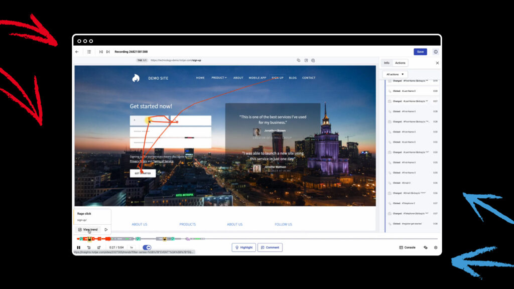
This helps us identify blind spots. For example: a page with strong traffic but low engagement could be hiding layout problems, unclear messaging or weak CTAs.
We also revisit the original goals of the site. Are they still relevant? Has the business evolved? If we originally built the site for the client, we treat audits as a scheduled checkpoint – a chance to reassess and adapt.
Even if we didn’t design or build your site originally, we can still audit its performance. We often work with clients who want to make meaningful improvements without committing to a full redesign. In these cases, we focus on identifying quick wins within the existing structure: tweaks to layout, messaging or navigation that reduce friction without requiring a major overhaul.
Set and forget? Big mistake
It’s a common mindset in B2B: the site’s live, job done.
But websites aren’t static assets. Your business changes. Your customers change, and their expectations change.
If you’re not checking in with your site every six to 12 months, you’re relying on guesswork. Without live data, you don’t know if people are engaging with the content. You don’t know if your pages are too long, too shallow, or just off-message. And if you’re waiting until your site’s performance drops to take action, you’ve already lost leads.
Clever UX in action: ANS.
One of our most complex recent UX challenges was the ANS website. Their audience included both SMEs and enterprise buyers – two very different groups with very different needs.
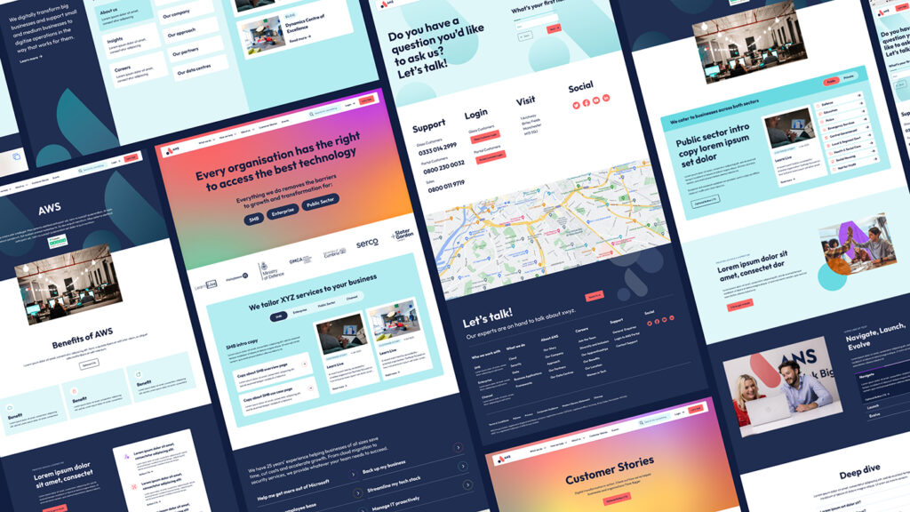
The structure, navigation and copy all had to flex to serve both. It wasn’t just about making the site clearer – it was about shaping the experience around the user’s mindset. We created a site that delivered optimal UX to both segments equally, without compromising on usability.
The numbers pretty much speak for themselves: 218% increase in form submissions; 65% increase in organic search traffic; 38% increase in pages per session.
(You can see the full case study here.)
Signs it’s time for a UX refresh
So when should you take a long, hard look at your current UX? Here are some key signs that the lights are starting to blink red:
- You get high bounce rates on key pages
- There’s a low scroll depth, suggesting people aren’t getting to the good stuff
- There’s a low engagement with forms, videos or CTAs
- Lots of drop-off points where users abandon the journey altogether
Those symptoms don’t mean your offer is weak. They mean your site isn’t pulling its weight.
One final quick tip…
If there’s one UX improvement every B2B site could make today, it’s this: cut the waffle.
Be clearer, faster. People are busy. They won’t spend 10 minutes trying to decode your value proposition. If your homepage is full of vague claims, jargon and bloated paragraphs, they’ll just go elsewhere.
You don’t need a complete redesign to fix that. Start with your most important pages. Strip them back. Be ruthless. Make it obvious what you do, who it’s for and why it matters.
Then ask yourself: would I stick around on this site?
An audit of your site’s UX could unlock big improvements. Let’s chat about that.

A newsletter actually worth reading
We dislike spam as much as you do. So we promise to only grace your inbox when we’ve got something valuable to say.